international

You are currently browsing the archive for the international category.

The National Science Foundation describe Data as:

numbers, images, video or audio streams, software and software versioning information, algorithms, equations, animations, or models/simulations.

Data, according to the Glossary of Archival and Records Terminology, are also

facts, ideas, or discrete pieces of information, especially when in the form originally collected and unanalyzed.

The art of photograffeur JR could then be data originally collected and assembled in such a way that the viewer can analyze their meaning.  His data are large photographs of regular people in caricatured poses that are displayed on trains, buses, rooftops, elevations of favela homes, the Palestinian/Israeli wall, sunken roads, staircase and surface all over – pervasive art.  His photos include basic metadata, such as the name, age, address of of subjects.  The stories associated / the analysis / the abstract of these data are found in the streets and neighbourhoods where context is, these are posted, told by the subjects and the dwellers.

These are data in action which shape and are shaped by the faces and place from whence they come.  These are embedded in the social scape and in the imaginary of the cultural sphere, one of the many locals of social change.n  “It is not about changing the world, but the changing the way we look at it” JR.

Watching this is a great New Years morning activity, and for Sep Kamvar I fell that data and statistics are the new black!  This is worth the 1 hour of your time!  dam, most online TV shows are 42 minutes and you learn way less…I should know 🙁

Merci Karl!

It is good to revisit the fundamentals.  These reports were part of the original discourse starting in 1992 on making data accessible.  The Earth Summit created Chapter 40. Information for Decision-Making which quite nicely lays out the importance of access to data. Down to Earth is the result of Rio +10. The GEOSS Data Sharing Action Plan brought together private sector, nations, research centres and NGOs to produce this comprehensive plan. You can read about the Data Sharing Principles of the multi million dollar data sets starting on page 137 of this document. It is a nice reminder that Open Data did not just show up as an idea in 2009 in Canada.  It has been simmering into a good broth for some time. Open data has become the base for a variety of soups appearing on actual menus and leaving the kitchen to nourish some real minds.


Jon Udell’s latest innovators podcast, Open Data Access with Steven Willmott:

There’s growing awareness of the need to publish data online, and to support programmatic access to that data. In this conversation, host Jon Udell talks with Steven Willmott about how his company, 3Scale, helps businesses create and manage application programming interfaces to their data.

Says Jon on his blog:

In the latest installment of my Innovators podcast, which ran while I was away on vacation, I spoke with Steven Willmott of 3scale, one of several companies in the emerging business of third-party API management. As more organizations get into the game of providing APIs to their online data, there’s a growing need for help in the design and management of those APIs.

By way of demonstration, 3scale is providing an unofficial API to some of the datasets offered by the United Nations. The UN data at http://data.un.org, while browseable and downloadable, is not programmatically accessible. If you visit 3scale’s demo at www.undata-api.org/ you can sign up for an access key, ask for available datasets — mostly, so far, from the World Health Organization (see below) — and then query them. [more…]

President-elect Obama & his team have a pretty firm grasp on technology it seems, with particularly exciting interest in opening government to transparency on the web. This is pretty exciting stuff. See how he has articulated the problems facing the US and technology leadership:

The Problem

We need to connect citizens with each other to engage them more fully and directly in solving the problems that face us. We must use all available technologies and methods to open up the federal government, creating a new level of transparency to change the way business is conducted in Washington and giving Americans the chance to participate in government deliberations and decision-making in ways that were not possible only a few years ago.

America risks being left behind in the global economy: Revolutionary advances in information technology, biotechnology, nanotechnology and other fields are reshaping the global economy. Without renewed efforts, the United States risks losing leadership in science, technology and innovation. As a share of the Gross Domestic Product, American federal investment in the physical sciences and engineering research has dropped by half since 1970.

Too many Americans are not prepared to participate in a 21st century economy: A recent international study found that U.S. students perform lower on scientific assessments than students in 16 other economically developed nations, and lower than 20 economically developed nations in math performance. Only one-third of middle class physical science teachers are qualified to teach in that subject, and only one-half of middle school math sciences have educational background in that subject area. [more…]

Among the the solutions proposed, here are a few of the headings:

  • Protect the Openness of the Internet
  • Encourage Diversity in Media Ownership
  • Safeguard our Right to Privacy
  • Open Up Government to its Citizens
  • Bring Government into the 21st Century

It goes on. I have not read in detail, but just about everything I have read I applaud. What actually happens is a different matter, but at least there is a vision outlined, and specific policies, almost all of which I cheer loudly.

Compared with the sad state of tech leadership in Canada. I could not even find a true technology platform from the Harper’s Conservatives (I’ve emailed his office to ask, but could someone point me to one?). Here’s the best thing I found, a grocery list of tech investments.

Conservatives invest in cutting-edge computer research

Prime Minister Stephen Harper reiterated his promise that a re-elected Conservative Government will invest in scientific research and development to help create jobs and to help Canada reach its potential to be a world leader in science and technology.

“Our government has invested over $9 billion in scientific research and development to create the next generation of well-paying, high-tech jobs,” the Prime Minister said.

Today, the Prime Minister announced that a re-elected Conservative Government will provide a $50-million grant to the Institute of Quantum Computing, located at the University of Waterloo. The Institute is a world leader in research and teaching in the field of quantum information, a discipline that could lead to new technologies and new jobs.

Since 2006, the Conservative Government has invested in a variety of leading-edge science and technology projects last year, including:

* $510 million to the Canadian Foundation for Innovation to support the modernization of Canada’s research infrastructure.
* $350 million to support leading Centres of Excellence in Commercialization and Research.
* An additional $100 million to Genome Canada for research and technology.
* Funding for research on key priorities, such as health sciences, energy, information and communications. [more…]

The Problem: Canada does not have a technology strategy.

The visuals I saw while watching the US elections on the tele on Tuesday were just plain dazzling.  Lots of speculative data, predictions, interactivity leading to scenarios and more speculation on the results, good visualizations, resulting from a visualization dissemination and creation infrastructure which manufactures the geographic imagination of the US Nation.  Obama stated in the speech that won him the candidacy for the Democrats (UK Guardian)

that there were no red states, no blue states, only the United States.

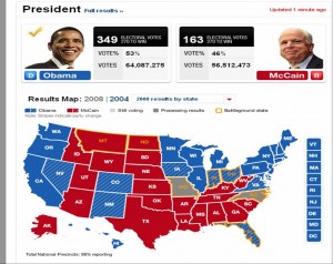
The maps we saw on US election night however, were all about blue and red differences.

Map of results by state

Map of results by state

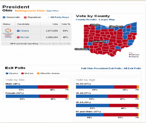
Zooming into county maps shows a different picture where colour speckles add up to a uniform blue for Ohio on the state map above. Many voices are not seen on the state map, the county map shows lots of diversity, as would the sub county map.  Maps tell all sorts of stories and can portray silences or consensus where in fact cacophonies and polarities exist. The county map looks way more red than blue for the Democratically won state of Ohio.

Speckles of red and blue in Ohio became a uniform Blue

Speckles of red and blue in Ohio became a uniform Blue

Reading about the US Electoral system helps explain how this works out.

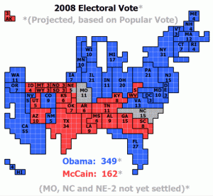
The map in popular culture is key to the formation of the collective imagination of the nation.  I do wonder if viewers will actually think that Hawaii and Alaska are really located in the ocean south of Arizona instead of one connected to Canada’s North and the other in the middle of the Pacific!

1 square = 1 electoral vote

1 square = 1 electoral vote

Information Aesthetics produced an excellent blog post which includes links to numerous electoral visuals.  Watching this also highlighted the lack of maps and visuals during the Canadian 2008 Elections.  Eventually I did see a map on the Tele, around 11:30 PM on Radio Canada, while CBC showed none!

The Socio-Economic Impact of the Spatial Data Infrastructure of Catalonia

Pilar Garcia Almirall, Montse Moix Bergadà, Pau Queraltó Ros
Universitat Politècnica de Catalunya
Centre of Land Policy and Valuations

M. Craglia (Editor)
European Commission
Joint Research Centre
Institute for Environment and Sustainability

This study gathered information and data from:

a sample of 20 local authorities participating in the Catalan SDI (IDEC) together with 3 control local authorities not participating in the SDI, and 15 end-user organisations, of which 12 are private companies operating in the Geographic Information (GI) sector, and 3 are large institutional users of GI. The findings of the interviews were presented in two separate workshops to the participating local authorities and end-user organisations, to validate the findings and discuss the outcomes.

Here are some of the findings:

  • main benefits of the IDEC accrue at the level of local public administration through internal efficiency benefits (time saved in internal queries by technical staff, time saved in attending queries by the public, time saved in internal processes) and effectiveness benefits (time saved by the public and by companies in dealing with public administration).
  • Extrapolating the detailed findings from 20 local authorities to the 100 that participate in the IDEC, the study estimated that the internal efficiency benefits account for over 500 hours per month. Using an hourly rate of €30 for technical staff in local government, these savings exceed €2.6 million per year.
  • Effectiveness savings are just as large at another 500 hours per month. Even considering only the efficiency benefits for 2006 (i.e. ignoring those that may have accrued in 2004-05, as well as the effectiveness benefits), the study indicates that the total investment to set up the IDEC and develop it over a four year period (2002-05) is recovered in just over 6 months.
  • Wider socio-economic benefits have also been identified but not quantified. In particular, the study indicates that web-based spatial services allow smaller local authorities to narrow the digital divide with larger ones in the provision of services to citizens and companies.

The study is methodologically heavy toward quantification of cost savings with some information pertaining to access to information and civicness associated to an increase in access to data.  It is mild on the latter, primarily because this is hardest and most subjective of measures.  But then again so is justice, equality and the good life.  I appreciate the quantification of costs, it makes the bean counters happy, I would however like to see more civicness measures and philosophical reasons for more access. I think that would lead to the creation of civic access measures.

btw – I have been a big fan of the editor of this report for years.

I am doing some work looking at broadband maps and atlases. I started off with a trip to the Carleton Map library, I followed some very knowledgeable map librarians around and picked up a huge roll of paper maps to begin exploring this new subject. I discovered an excellent little folding paper map on Digital Inclusion. As I was looking at its sources I discovered that this map was part of a broader and very exciting online Atlas project that includes numerous map themes on social justice, environment, health, etc.

I like these maps because they are aesthetically pleasing, are accompanied by a table of content explaining the themes and indicators represented, and with data sources (aka metadata) that are made obvious and easy to understand. Each map w/its associated information is an overview of an issue. There are membership requirements to access additional data related to the maps. http://maps.maplecroft.com/

http://maps.maplecroft.com/
Finally, this company has an interesting business model. The publication of the paper map was sponsored by Alcatel and is a superb information marketing tool at conferences, the UN, WDB, ADB, OECD etc. It is also excellent swag. Maplecroft is also

a successful specialist research and advisory company focused on the non-financial performance of large multinationals. It has a strong corporate client base and research partnerships with leading international organisations, such as those within the auspices of the United Nations, the World Economic Forum and prominent independent non-governmental organisations.

Maplecroft has developed particular expertise in strategy, management systems, indicators, cross sector partnership building, stakeholder engagement, audit, and risk management. It has a specific interest in cross sector engagement.

Primarily a commercial organisation, Maplecroft has formed and facilitated several strong multi-lateral partnerships with business, lobby groups and aid organisations for mutual benefit. It fundamentally operates as a social enterprise, whereby non-profit partner organisations gain from commercial engagements it may form. Maplecroft undertakes a great deal of pro-bono work, and seeks opportunities to contribute to the initiatives with which it becomes involved.

The cost of producing the high quality maps and associated information seen here is in the hundreds of thousands of dollars, the technology is the easy part, it is the cost of the minds and data associated with knowledge production and the maintenance of a reliable and trustworthy product that is really high. Few organizations beyond government can take on this sort of project on. It is most certainly an interesting and ethically driven business model.

1. The Value of Spatial Information (Exec. Sum, Full Report) a ACIL Tasman report commissioned by the Cooperative Research Centre for Spatial Information (CRCSI).

2. the 1999 Oxera Report (Oxford Ecomomic Research Associates Ltd.) commissioned by the UK Ordnance Survey.

3. U.S. CODATA Reports published by the National Science Foundation (Free to read online)

4. The European Commission GI and GIS – Documents

5. Commercial Exploitation of Europe’s Public Sector Information, PIRA International study of 2000, Summary, Full Report

There is a very good discussion on how to deconstruct and compare the methodologies and results of the two first documents on the GSDI Legal and Economic Working Group Discussion List. This list has some of the top thinkers in the field of data access from an academic, legal, scientific and public institution standpoint. The list includes an archive that is well worth searching if ever looking for resources on this topic and to hear folks debate the details of these and many other data related issues.

Coalition Casualty Count is a site managed by independent US citizens who analytically count the coalition casualties

for Operation Iraqi Freedom and Operation Enduring Freedom [Afghanistan]. We attempt to be up to date, precise, accurate and reliable.

There are many other sites on the web that list information of Fatalities from Iraq , but few if any of them do this in an analytical fashion. We endeavor to provide not just a list of names but a resource detailing when, where and how fatalities occurred.

You can read their methodology here.  I am always happy when I get to see the data and read how they were assembled, this provides me with the means to critically assess what is being presented to me.  I love the myriad visualization tools that are emerging on the net however, I wish they were accompanied by metadata which helps me better understand and decide whether or not I trust what is being said to me.

There are alot of data points and even some maps on this site and these folks are commended for doing this work and telling this important story.  There is also a list of the Canadian men and women causalities in Afghanistan.

via: Spatial Sustain

« Older entries