Art

You are currently browsing the archive for the Art category.

The National Science Foundation describe Data as:

numbers, images, video or audio streams, software and software versioning information, algorithms, equations, animations, or models/simulations.

Data, according to the Glossary of Archival and Records Terminology, are also

facts, ideas, or discrete pieces of information, especially when in the form originally collected and unanalyzed.

The art of photograffeur JR could then be data originally collected and assembled in such a way that the viewer can analyze their meaning.  His data are large photographs of regular people in caricatured poses that are displayed on trains, buses, rooftops, elevations of favela homes, the Palestinian/Israeli wall, sunken roads, staircase and surface all over – pervasive art.  His photos include basic metadata, such as the name, age, address of of subjects.  The stories associated / the analysis / the abstract of these data are found in the streets and neighbourhoods where context is, these are posted, told by the subjects and the dwellers.

These are data in action which shape and are shaped by the faces and place from whence they come.  These are embedded in the social scape and in the imaginary of the cultural sphere, one of the many locals of social change.n  “It is not about changing the world, but the changing the way we look at it” JR.
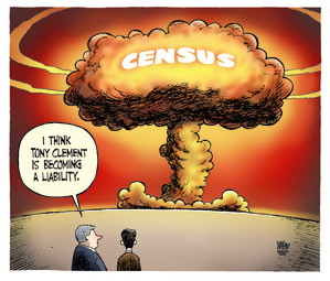
From the Toronto Star

Toronto Sun
by Patrick Corrigan

Theo Moudakis/Toronto Star
By Theo Moudakis


By Michael de Adder

Yup! I am not sure I would want all the personal data in the dbase public, but the non private stuff, such as the images that do not identify the persons and the associated metadata describing the tattoos would be a really interesting research too for those doing body studies.

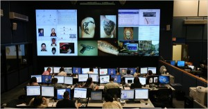
Inside the New York Police Department's Real Time Crime Center, analysts search databases for information gleaned from arrests, accident reports and victim complaints. By MICHAEL S. SCHMIDT Published: February 17, 2010

The database is part of the New York Police Department’s Real Time Crime Center. Wholly tomoli it also includes

a database for body marks, like birthmarks and scars. It keeps track of teeth, noting missing ones and gold ones. It keeps track of the way people walk: if there is a limp, it notes its severity. And it has a so-called blotchy database, of skin conditions…The databases are fed, in part, by arrest reports; officers are instructed to take detailed notes and enter them into a computer program that moves the information to a large server…The databases pull from 911 calls, arrests, complaints filed by victims, reports on accidents and moving violations.

It seems that some tattoos lack a bit of originality. A keyword search on ‘I love you’ yields 596 hits!

To use the tattoo database, detectives can enter either words or images they believe may be in the tattoo. A search request can also include the part of the body that bears the tattoo…“Jailhouse tattoos, tribal tattoos, those are sometimes hard to write down descriptions for because either we don’t know what they are or what they mean,” Sergeant Lonergan said. “Asian symbols are easier.”

When is information too much information? In this case it is a fine line. In my naive optimist days, we would only want this information for cultural research. My realist side tells me that there are many ways to find the bad guys. Crime is down in New York, even if there is debate about juking the stats. As stated earlier socio-anthropological research potential of this dbase if accessible in a way where the private information is kept out, would just be sublime though!

NY Times articles Have a Tattoo or Walk With a Limp? The Police May Know and Retired Officers Raise Questions on Crime Data.

[via Boing Boing]

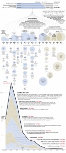
This is a great way to make a complex document – a national budget or a Stimulus Package – tangible and accessible.  I think newspapers are starting to compete with each other as we are starting to see some great on-line visualizations, New York Times, USA Today and now the Washington Post.

I think the following viz would be even better if the image was hyperlinked to the actual budget document and each bubble took you to the section it represents.  But alas!  This stuff is hard work and this image is a fine start!

via – Flowing Data

Visualization of the US Stimulation Package

Visualization of the US Stimulus Package

Visualizing Information for Advocacy: An Introduction to Information Design written and designed by John Emerson, Principal at Apperceptive LLC. & Backspace and coordinated and produced by the Tactical Technology Collective.

Visualizing Advocacy

This beautiful pamphlet teaches basic Information design which is the use of

pictures, symbols, colors, and words to communicate ideas, illustrate information or express relationships visually.

The objective is to assist NGOs to communicate with information design so they can:

  • tell their story to a variety of constituencies;
  • use it as an advocacy tool, for outreach or for education.
  • facilitate strategic planning by making a visual map of a given situation.

There is access to data and there is making data accessible. This is the first grassroots data aesthetic communication tool I have ever come across, and it is wonderful.

I have a thing about cars, idling, air quality and really appreciate it when people develop interesting visualizations & sonifications that make car population issues tangible by using metaphors which make those data meaningful. While this is an HR intensive and expensive visualization project, it could not have been done without access to some free data and in this case Madrid Movilidad. I would have liked a bit more metadata and metholodological explanations to accompany the visualizations though! Nonetheless, this project reinforces the argument that experimentation and innovation comes with free data!

Cascade on Wheels is a visualization project that intends to express the quantity of cars we live with in big cities nowadays. The data set we worked on is the daily average of cars passing by streets, over a year. In this case, a section of the Madrid city center, during 2006. The averages are grouped down into four categories of car types. Light vehicles, taxis, trucks, and buses.

We made two different visualizations of the same data set. We intended not just to visualize the data in a readable way, but also to express its meaning, with the use of metaphors. In the Walls Map piece, car counts are represented by 3D vertical columns emerging from the streets map, like walls. The Traffic Mixer piece, where noise is the metaphor, is an hybrid of a visualization and a sound toy. The first piece focuses more on showing the data in a readable and functional way, while the latter focuses more on expressing the meaning of the data and immersing the user into these numbers. Both pieces try to complete each other.

Check out their videos!

rice as visual data

A short promotional video of the Stan’s Cafe performance installation, Of All The People In All The World, in which rice is used to represent human statistics.

[via infosthetics]

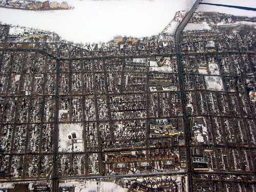
geoporn

nice aerial pic of montreal’s north shore:

montreal's north shore

[via spacingmontreal]

From the economist:

A good graphic can tell a story, bring a lump to the throat, even change policies. Here are three of history’s best…

They chose these 3:

  • Florence Nightingale’s chart of the causes of the deaths of soldiers in the Crimean war
  • Charles Joseph Minard’s chart of Napoleon’s Russian campaign of 1812
  • William Playfair’s chart of “weekly wages of a good mechanic” and the “price of a quarter of wheat” against monarchs.

death chart

[link…]

« Older entries