Articles by Tracey

I like data and think it should be shared at not cost! Especially public data!

USA today produced this interesting interactive map Shifting Religious Identities which renders and makes visual data from the American Religious Identification Survey (ARIS) conducted by Trinity College scholars. The data, report and methodology from/of this survey are available to the public.  In addition, the project makes available previous surveys with their associated documentation in their archive.

In Canada, the Statistics Canada Census collects this information by

religious affiliation only, regardless of whether respondents actually practice their religion. Data on the frequency of attendance at religious services have been collected by Statistics Canada’s General Social Survey since 1986. The survey samples adults aged 15 and over living in private households in the 10 provinces (1).

The 2001 overview provides some interesting data, a bit dated, only at the provincial and community scale and not rendered in an interesting way.  If you want more detail you must purchase it.  A map like the USA Today one could be rendered with what is made available but alas Canadian newspapers are no way near as savvy as the ones in the US when it comes to data visualization, let alone talking about and using statistics!

Contradicting the StatCan quote above,

the census has been collecting data on religion since 1871. Since this question is asked in decennial censuses (every 10 years), it was last asked in 2001 and was not included on the 2006 Census questionnaire. (2)

That question is also only asked to 20% of the population that fills out the Census.  Some general information is available for free in the Community Profiles on a location by location basis but not for small census geographies and not for many communities at the same time.  Those data at those geographies are available to fee paying citizens.

Perhaps Canadian churches, mosques, synagoges, gudwaras, temples etc. can pass the data donation basket to purchase some of this information!

I always enjoy looking at data analysis experiments from people who just like to play with numbers and who want to figure odd stuff out.  The former fun find today was this gem Books and Music That Make You Dumb where CalTeck student Virgil Griffith

used aggregated Facebook data about the favorite bands and books among students of various colleges and plotted them against the average SAT scores at those schools, creating a tongue-in-cheek statistical look at taste and intelligence.

Griffith is also the creator of

WikiScanner, a database that tracks the IP addresses of anonymous Wikipedia editors, he revealed that the CIA, the Vatican, and staff of various members of Congress (among others) had made edits on the site to remove potentially sensitive information.

As for the latter, I came across a title called Spamdog Millionaire – The geography of social media spam, which I could not resist reading! In this case Philip Jacob on the StyleFeeder Tech Blog did the following

For each account that we have closed due to spammy activity, I ran their source IP addresses through a GeoIP lookup and graphed the data using DabbleDB (which I had been meaning to play with for some time – more on that later). The result: India, in a word. Pakistan, too.

The visualization was not earth shattering, however the conversation about what to do with that information was infrastructurally and geographically interesting.  The discussion centrered on the ethic of firewalling entire countries for the bad behaviours of some, and what it means when bad netizens from certain regions of the world get their nations access to content cut off!

Via: Polymeme

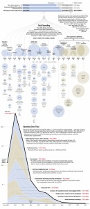
This is a great way to make a complex document – a national budget or a Stimulus Package – tangible and accessible.  I think newspapers are starting to compete with each other as we are starting to see some great on-line visualizations, New York Times, USA Today and now the Washington Post.

I think the following viz would be even better if the image was hyperlinked to the actual budget document and each bubble took you to the section it represents.  But alas!  This stuff is hard work and this image is a fine start!

via – Flowing Data

Visualization of the US Stimulation Package

Visualization of the US Stimulus Package

Imagine a Canadian Data Agency (CDA)!

US National Data Agency (NDA)

hmmmmmmm!

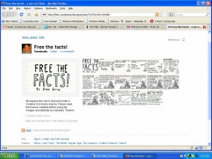
Zara over on CivicAccess.ca forwarded the following Free the Facts story to the list.  It is a really great way to get the issue across.  I also love flickr being used in that way!

I have been neglectful of this wonderful space and am now getting back to it!  As a warmer upper, Hugh, suggested that I post the following that I sent to the CivicAccess.ca list.  I have been doing lots of thinking in this area, and I have decided to pursue a PHD on the topic of data access in Canada and hope to share some of my readings & findings as I go along.

In addition, I have been reading lots of great data laden reports in public health, on the topic of quality of life, and collecting data from a multitude of sources that I will get to talking about at some point.  Until then you can read some of the documents and reports that I have tagged here and here.

Thinking about data

So these days I have to write a proposal, and it involves data, infrastructures, and geographic imagination. And as I was reading an article about criminological data models, governmentality, and biopolitics I came across this fellow Ian Hacking.

Prof. Hacking wrote about how:

  • statistical probability came to be in the 17th century;
  • the science of prediction and probability shaped categorizations of people into this and into that,
  • those categories that did not exist before the statistical analysis, came to become social realities and
  • probability can allow you to predict occurrences within a population according to a set of probabilities but alas at the scale of the individual things are totally random!

Ian Hacking is a Canadian Philosopher and a fellow at the College de France – the only anglo accepted thus far – same schools as Michel Foucault.

Why do I care and why am I sharing this?  Well, it has to do with access to data and who is creating the categories we come to live by and believe, what it means when government rationalization comes in the form of statistics discussing populations, and that only the government and wealthy organizations have access to the means to those rationalizations.

During the course of proposal writing I re-read the Chapter on the Census, Map and Museum in Benedict Anderson’s Book Imagined Communities.  He discusses how these three institutions were instrumental at framing the colonial gaze in Asia.  He also explained that these institutions told us more about the colonial mentalité and less about those they being counting, mapping and whose artifacts got collected.  Finally, he demonstrated how these institutions and the categories, territories and anthropoligies eventually got believed by the local, re-puporsed, acted and performed in reality, eventually, becoming ancestors.  Bref – manufacturing an odd imagination of who one is.  Those who counted, mapped and assembled got to tell the stories.  And it is these stories that left traces.

After reading about Ian Hacking’s work, I listened to a CBC ideas interview with him.  Brilliant! He discusses taming chance, statistical thinking, normativity, wanting to be normal and adapting to categories which make up people and shape a type of social reality.  Access to data I think is about enabling more than a few to question, assess and shape reality.  It is also about questioning who has the monopoly on the data that allow us to interpolate the terrain of our geographic imagination – who we are, our identity, issues, how we see ourselves.

Andrew Pickering, who studies the sociology of science, was also interviewed by Paul Kennedy in the same Ideas program, and he brought up Deleuze and Guattari’s concept of nomad science vs royal science.  The latter a science that continues to support the known and accepted ways of doing things the former a more distributed form of science out of the academe.  I think web 2.0, open access, open source, open data are about nomad science – which i will explore a little more.

I then listened to Brian Wynne, a Prof. of Science Studies in the same ideas series but a different show who discussed how science and technology somehow are beyond the realm of politics.  He discusses in his work on The Public Value of Science how some sciences are imagined, how these are delusions, and are provocations and how these are constructed in the public mind.

I am trying, in my own work, to get at the idea that data help us form a picture of reality, and the more of us that get the opportunity to play with them, learn about them, value them, the more pictures we may create that may invert, contest and change something, question what we are currently being told in an educated way, wonder about what we are not told, what is silenced or worse just plain ignored, how our imagination is shaped, ways we may want to shape it and some new social realities we may want to aim for.

Or to use a term from a lecture given by Darin Barney, I think data are part of the means by which we can do citizenship, doing citizenship involves judging and acting on that judgement, and I believe that data are an integral part of making good judgement upon which to act.

**************

as an FYI The entire CBC lecture series on How to Think about Science is just plain great.
This paper includes an awesome table (p.003) which outlines attributes related to research data sharing in academic health centres.  The table includes determinants of data access from the perspective of data storage, controls on access to data, and who determines access permissions.

The paper also includes 7 recommendations for Academic Health Centres (AHC) to encourage data sharing which I think can be modified to suit other contexts:

  1. Commit to sharing data as openly as possible, given privacy constraints.  Streamline institutional review boards, technology transfer, and information technology policies and procedures accordingly.
  2. Recognize data sharing contributions in hiring and promotion decisions, perhaps as a bonus to a publication’s impact factor.  Use concrete metrics when available. [I like that they understand the incentive structures of this group]
  3. Educate trainees and current investigators on responsible data sharing and reuse practices through class work, mentorship, and professional development.  Promote a framework for deciding upon appropriate data sharing mechanisms.
  4. Encourage data sharing practices as part of publication policies.  Lobby for explicit and enforceable policies in journal and conference instructions, to both authors and peer reviewers.
  5. Encourage data sharing plans as part of funding policies.  Lobby for appropriate data sharing requirements by funders, and recommend that they assess a proposal’s data sharing plans as part of its scientific contributions.
  6. Fund the cost of data sharing, support for repositories, adoption of sharing infrastructure and metrics, and research into best practices through federal grants and AHC funds.
  7. Publish experiences in data sharing to facilitate the exchange of best practices.

I have not looked at this literature in a while, but my sense is the discourse is moving away from problems to providing solutions.  Most importantly in the case of this paper, they are culture shifting since, in a sense they a pushing toward an open access ideology by creating an environment conducive to sharing by hiring the right people, providing the appropriate incentives, marketing successes, changing publication practices, educating and promoting open access within.  This is most interesting as this is the medical profession, a bastion of commerce and privacy concerns that is moving to open access faster than our Statistical Agency in Canada!

The full paper is available for free in myriad formats!

Piwowar HA, Becich MJ, Bilofsky H, Crowley RS, on behalf of the caBIG Data Sharing and Intellectual Capital Workspace (2008), Towards a Data Sharing Culture: Recommendations for Leadership from Academic Health Centers. PLoS Med 5(9): e183

The publisher, PLoS Medicine:

PLoS Medicine believes that medical research is an international public resource. The journal provides an open-access venue for important, peer-reviewed advances in all disciplines. With the ultimate aim of improving human health, we encourage research and comment that address the global burden of disease.

PLoS Medicine (eISSN 1549-1676; ISSN-1549-1277) is an open-access, peer-reviewed medical journal published monthly online by the Public Library of Science (PLoS), a nonprofit organization. The inaugural issue was published on 19 October 2004.

Ready or Not, Here Comes Open Access: Sure, you’d rather focus on science than on debates about open access. But the decisions made today about publishing models are relevant not only to your work, but also to the future of biomedical research. So pay attention.

November issue of Genome Technology focuses entirely on Open Access openly available under a CC license.  The articles discussed both data and publications.  Wonderful! See page 40 of the journal to read Ready or Not, Here Comes Open Access.

Via: SPARC, the Scholarly Publishing and Academic Resources Coalition

Tags:

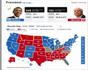
The visuals I saw while watching the US elections on the tele on Tuesday were just plain dazzling.  Lots of speculative data, predictions, interactivity leading to scenarios and more speculation on the results, good visualizations, resulting from a visualization dissemination and creation infrastructure which manufactures the geographic imagination of the US Nation.  Obama stated in the speech that won him the candidacy for the Democrats (UK Guardian)

that there were no red states, no blue states, only the United States.

The maps we saw on US election night however, were all about blue and red differences.

Map of results by state

Map of results by state

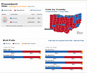
Zooming into county maps shows a different picture where colour speckles add up to a uniform blue for Ohio on the state map above. Many voices are not seen on the state map, the county map shows lots of diversity, as would the sub county map.  Maps tell all sorts of stories and can portray silences or consensus where in fact cacophonies and polarities exist. The county map looks way more red than blue for the Democratically won state of Ohio.

Speckles of red and blue in Ohio became a uniform Blue

Speckles of red and blue in Ohio became a uniform Blue

Reading about the US Electoral system helps explain how this works out.

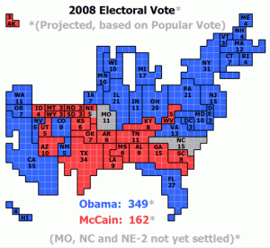
The map in popular culture is key to the formation of the collective imagination of the nation.  I do wonder if viewers will actually think that Hawaii and Alaska are really located in the ocean south of Arizona instead of one connected to Canada’s North and the other in the middle of the Pacific!

1 square = 1 electoral vote

1 square = 1 electoral vote

Information Aesthetics produced an excellent blog post which includes links to numerous electoral visuals.  Watching this also highlighted the lack of maps and visuals during the Canadian 2008 Elections.  Eventually I did see a map on the Tele, around 11:30 PM on Radio Canada, while CBC showed none!

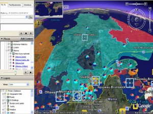
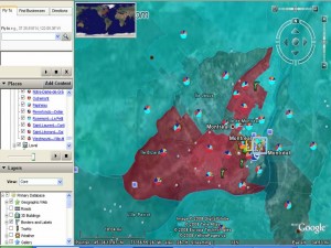
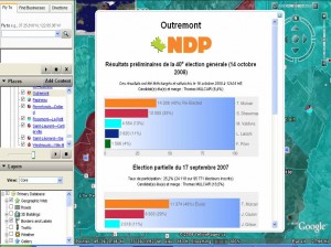
This is really interesting way to look at the election results.  Cédric, developed this excellent interactive Elections 2008 Mashup which uses the GeoGratis.ca Electoral Boundary file and the Elections Canada CSV data files of the results for the 38th, 39th and 40th elections and validated some of the data with information from Parliament of Canada Website.   He used Google Earth and Google Charts and associated code as his tools and shares the how to here.

While I do not find Google Earth maps pretty, I do like the flight angles, I love watching how the scale shifts as the earth moves from globe, to Canada, Québec, Montreal and then to the riding.  I really enjoy seeing the information pop up on the landscape and the satelitte imagerie in the background.  Cédric also used some nice cartographic techniques by shading electoral district colours to the proportion of the vote for the winning party.  At a glance it looks like he selected a lighter colour if the vote was less than 50% and a more sure solid colour when the vote is more than 50%.  I also aesthetically appreciated having the ridings transparent allowing the viewer to see the air photo/satellite images of the city and connecting the political process with a physical or tangible reality in the background.  I was impressed that uncertainty was visually represented on the electoral terrain.  It is notoriously difficult on a map to reveal multiple voices, and choropleth maps in particular are tricky as the polygon of a uniform colour deceives the reader into seeing/thinking/imagining the bounded social and physical terrain/phenomenon as being uniform.

Cédric SAM

Cédric SAM Election Mashup

Cédric SAM

Cédric SAM Election Mashup

Cédric Sam Election Mashup

Cédric Sam Election Mashup

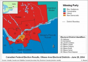
Glenn Brauen was able to use audio on his maps of the 39th election to feature uncertainty, complexity and multiplicity.  On his maps the proportion of the vote determined the audio levels of a speech read by the leader of each party. These audio files were then combined and attached to the electoral district.  As the users scrolls over the district multiple voices are heard, you may hear a clear and distinct leader’s voice and the others lower in the background, or in cases where the vote was very close you hear competing voices or cacophonie making ovious that red/blue/orange or light blue does not necessarily imply a clear win nor uniformity.  It was a really innovative way to show multiplicity.  He also used interesting open source technologies to create these: Scalable Vector Graphics (SVG) (W3 standard for web graphics), Java, and Adobe as well as NunaliitGlenn like Cédric shares his methodology, and graciously distributes his work on a CC license.

Glenn Brauen, Web mapping with sound using SVG

Glenn Brauen, Web mapping with sound using SVG

« Older entries § Newer entries »