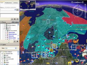
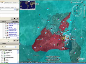
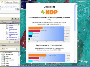
This is really interesting way to look at the election results. Cédric, developed this excellent interactive Elections 2008 Mashup which uses the GeoGratis.ca Electoral Boundary file and the Elections Canada CSV data files of the results for the 38th, 39th and 40th elections and validated some of the data with information from Parliament of Canada Website. He used Google Earth and Google Charts and associated code as his tools and shares the how to here.
While I do not find Google Earth maps pretty, I do like the flight angles, I love watching how the scale shifts as the earth moves from globe, to Canada, Québec, Montreal and then to the riding. I really enjoy seeing the information pop up on the landscape and the satelitte imagerie in the background. Cédric also used some nice cartographic techniques by shading electoral district colours to the proportion of the vote for the winning party. At a glance it looks like he selected a lighter colour if the vote was less than 50% and a more sure solid colour when the vote is more than 50%. I also aesthetically appreciated having the ridings transparent allowing the viewer to see the air photo/satellite images of the city and connecting the political process with a physical or tangible reality in the background. I was impressed that uncertainty was visually represented on the electoral terrain. It is notoriously difficult on a map to reveal multiple voices, and choropleth maps in particular are tricky as the polygon of a uniform colour deceives the reader into seeing/thinking/imagining the bounded social and physical terrain/phenomenon as being uniform.
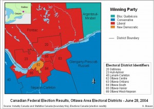
Glenn Brauen was able to use audio on his maps of the 39th election to feature uncertainty, complexity and multiplicity. On his maps the proportion of the vote determined the audio levels of a speech read by the leader of each party. These audio files were then combined and attached to the electoral district. As the users scrolls over the district multiple voices are heard, you may hear a clear and distinct leader’s voice and the others lower in the background, or in cases where the vote was very close you hear competing voices or cacophonie making ovious that red/blue/orange or light blue does not necessarily imply a clear win nor uniformity. It was a really innovative way to show multiplicity. He also used interesting open source technologies to create these: Scalable Vector Graphics (SVG) (W3 standard for web graphics), Java, and Adobe as well as Nunaliit. Glenn like Cédric shares his methodology, and graciously distributes his work on a CC license.


Comments on Posts