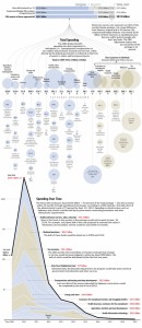
This is a great way to make a complex document – a national budget or a Stimulus Package – tangible and accessible. I think newspapers are starting to compete with each other as we are starting to see some great on-line visualizations, New York Times, USA Today and now the Washington Post.
I think the following viz would be even better if the image was hyperlinked to the actual budget document and each bubble took you to the section it represents. But alas! This stuff is hard work and this image is a fine start!
via – Flowing Data


-
Pingback from Looking at a Stimulus Package « WickedEco on March 15, 2009 at 2:04 pm
Comments are now closed.

2 comments