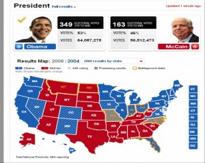
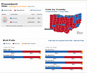
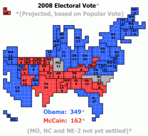
The visuals I saw while watching the US elections on the tele on Tuesday were just plain dazzling. Lots of speculative data, predictions, interactivity leading to scenarios and more speculation on the results, good visualizations, resulting from a visualization dissemination and creation infrastructure which manufactures the geographic imagination of the US Nation. Obama stated in the speech that won him the candidacy for the Democrats (UK Guardian)
that there were no red states, no blue states, only the United States.
The maps we saw on US election night however, were all about blue and red differences.
Zooming into county maps shows a different picture where colour speckles add up to a uniform blue for Ohio on the state map above. Many voices are not seen on the state map, the county map shows lots of diversity, as would the sub county map. Maps tell all sorts of stories and can portray silences or consensus where in fact cacophonies and polarities exist. The county map looks way more red than blue for the Democratically won state of Ohio.
Reading about the US Electoral system helps explain how this works out.
The map in popular culture is key to the formation of the collective imagination of the nation. I do wonder if viewers will actually think that Hawaii and Alaska are really located in the ocean south of Arizona instead of one connected to Canada’s North and the other in the middle of the Pacific!
Information Aesthetics produced an excellent blog post which includes links to numerous electoral visuals. Watching this also highlighted the lack of maps and visuals during the Canadian 2008 Elections. Eventually I did see a map on the Tele, around 11:30 PM on Radio Canada, while CBC showed none!


Comments on Posts