maps

You are currently browsing the archive for the maps category.

I am doing some work looking at broadband maps and atlases. I started off with a trip to the Carleton Map library, I followed some very knowledgeable map librarians around and picked up a huge roll of paper maps to begin exploring this new subject. I discovered an excellent little folding paper map on Digital Inclusion. As I was looking at its sources I discovered that this map was part of a broader and very exciting online Atlas project that includes numerous map themes on social justice, environment, health, etc.

I like these maps because they are aesthetically pleasing, are accompanied by a table of content explaining the themes and indicators represented, and with data sources (aka metadata) that are made obvious and easy to understand. Each map w/its associated information is an overview of an issue. There are membership requirements to access additional data related to the maps. http://maps.maplecroft.com/

http://maps.maplecroft.com/
Finally, this company has an interesting business model. The publication of the paper map was sponsored by Alcatel and is a superb information marketing tool at conferences, the UN, WDB, ADB, OECD etc. It is also excellent swag. Maplecroft is also

a successful specialist research and advisory company focused on the non-financial performance of large multinationals. It has a strong corporate client base and research partnerships with leading international organisations, such as those within the auspices of the United Nations, the World Economic Forum and prominent independent non-governmental organisations.

Maplecroft has developed particular expertise in strategy, management systems, indicators, cross sector partnership building, stakeholder engagement, audit, and risk management. It has a specific interest in cross sector engagement.

Primarily a commercial organisation, Maplecroft has formed and facilitated several strong multi-lateral partnerships with business, lobby groups and aid organisations for mutual benefit. It fundamentally operates as a social enterprise, whereby non-profit partner organisations gain from commercial engagements it may form. Maplecroft undertakes a great deal of pro-bono work, and seeks opportunities to contribute to the initiatives with which it becomes involved.

The cost of producing the high quality maps and associated information seen here is in the hundreds of thousands of dollars, the technology is the easy part, it is the cost of the minds and data associated with knowledge production and the maintenance of a reliable and trustworthy product that is really high. Few organizations beyond government can take on this sort of project on. It is most certainly an interesting and ethically driven business model.

New Cartographers

Great article, The New The New Cartographers, by Jessica Clark, from In These Times:

Maps are everywhere these days. The ubiquity of global positioning systems (GPS) and mobile directional devices, interactive mapping tools and social networks is feeding a mapping boom. Amateur geographers are assigning coordinates to everything they can get their hands on—and many things they can’t. “Locative artists” are attaching virtual installations to specific locales, generating imaginary landscapes brought vividly to life in William Gibson’s latest novel, Spook Country. Indeed, proponents of “augmented reality” suggest that soon our current reality will be one of many “layers” of information available to us as we stroll down the street.

[more…]

A great map of Australia, as seen by traditional aboriginal tribes. I can’t imagine the Canadian government doing something like this.

One curious note, below the map, the fine print says:

Disclaimer and Warning: Not suitable for use in native title and other land claims

[via: foe]

Check out what open public transit data is available in Finland:

http://transport.wspgroup.fi/hklkartta/

I suspect a small minority of transit authorities in Canada may actually have GPS units on board buses, but I haven’t heard of any making the data publicly accessible — and not in such fine form. This is really beautiful to see, but it fills me with shame that we are light-years behind.

Original article in the Guardian:

http://www.guardian.co.uk/technology/2008/feb/28/research.transport

Is anyone aware of any real-time data being made available in Canada?

I have a thing about cars, idling, air quality and really appreciate it when people develop interesting visualizations & sonifications that make car population issues tangible by using metaphors which make those data meaningful. While this is an HR intensive and expensive visualization project, it could not have been done without access to some free data and in this case Madrid Movilidad. I would have liked a bit more metadata and metholodological explanations to accompany the visualizations though! Nonetheless, this project reinforces the argument that experimentation and innovation comes with free data!

Cascade on Wheels is a visualization project that intends to express the quantity of cars we live with in big cities nowadays. The data set we worked on is the daily average of cars passing by streets, over a year. In this case, a section of the Madrid city center, during 2006. The averages are grouped down into four categories of car types. Light vehicles, taxis, trucks, and buses.

We made two different visualizations of the same data set. We intended not just to visualize the data in a readable way, but also to express its meaning, with the use of metaphors. In the Walls Map piece, car counts are represented by 3D vertical columns emerging from the streets map, like walls. The Traffic Mixer piece, where noise is the metaphor, is an hybrid of a visualization and a sound toy. The first piece focuses more on showing the data in a readable and functional way, while the latter focuses more on expressing the meaning of the data and immersing the user into these numbers. Both pieces try to complete each other.

Check out their videos!

Well the folks (Matt Ball and Jeff Thurston) over at Spatial Sustain a Vector 1 Media blog have a great article exactly about that topic here. The article discusses free data as a platform for economic expansion, how free geospatial data weighed against cost represents a return on investment, industry creation based on government free data in the US.

Free federal data spurred free market competition. If the data were locked up to begin with, the market would never have taken off. There wouldn’t be the level of investment in technology, and we’d be much poorer in terms of both economic benefit and our knowledge of our world.

A few years back Gabe Sawhney and I co-prepared and Gabe gave the presentation entitled CivicAccess.ca: Democracy in an information age and the need for free and open civic data at Geotec organized by Matt and it is nice to see Matt doing some new stuff.

MySociety has released some very useful and sexy interactive travel-time maps for the UK using public data.

Ted at GANIS blog introduces this very interesting data visualization initiative – The British Columbia Atlas of Wellness.

Here.

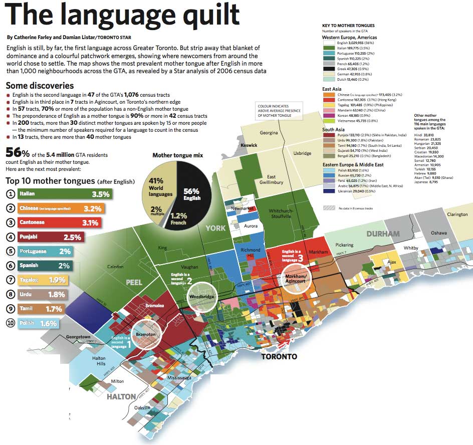
The Toronto Star has a big map of languages spoken in Toronto, using 2006 census data.

Bricoleururbanism.org, a wonderful blog, has digested some of the map images for you, and here is one:

toronto quilt

Via: Spacingmontreal.ca

Makes me think of a good question for schools and universities: why aren’t you guys doing this stuff in your classes and publishing it like crazy? Wouldn’t it be nice if a big chunk of school work was designed to be actually useful to the world, and actually was? And was distributed freely on the net?

Newer entries »