geo

You are currently browsing the archive for the geo category.

I have a thing about cars, idling, air quality and really appreciate it when people develop interesting visualizations & sonifications that make car population issues tangible by using metaphors which make those data meaningful. While this is an HR intensive and expensive visualization project, it could not have been done without access to some free data and in this case Madrid Movilidad. I would have liked a bit more metadata and metholodological explanations to accompany the visualizations though! Nonetheless, this project reinforces the argument that experimentation and innovation comes with free data!

Cascade on Wheels is a visualization project that intends to express the quantity of cars we live with in big cities nowadays. The data set we worked on is the daily average of cars passing by streets, over a year. In this case, a section of the Madrid city center, during 2006. The averages are grouped down into four categories of car types. Light vehicles, taxis, trucks, and buses.

We made two different visualizations of the same data set. We intended not just to visualize the data in a readable way, but also to express its meaning, with the use of metaphors. In the Walls Map piece, car counts are represented by 3D vertical columns emerging from the streets map, like walls. The Traffic Mixer piece, where noise is the metaphor, is an hybrid of a visualization and a sound toy. The first piece focuses more on showing the data in a readable and functional way, while the latter focuses more on expressing the meaning of the data and immersing the user into these numbers. Both pieces try to complete each other.

Check out their videos!

Well the folks (Matt Ball and Jeff Thurston) over at Spatial Sustain a Vector 1 Media blog have a great article exactly about that topic here. The article discusses free data as a platform for economic expansion, how free geospatial data weighed against cost represents a return on investment, industry creation based on government free data in the US.

Free federal data spurred free market competition. If the data were locked up to begin with, the market would never have taken off. There wouldn’t be the level of investment in technology, and we’d be much poorer in terms of both economic benefit and our knowledge of our world.

A few years back Gabe Sawhney and I co-prepared and Gabe gave the presentation entitled CivicAccess.ca: Democracy in an information age and the need for free and open civic data at Geotec organized by Matt and it is nice to see Matt doing some new stuff.

geohash

geohash.org offers short URLs which encode a latitude/longitude pair, so that referencing them in emails, forums, and websites is more convenient.

mapping london

I’m in an Advanced GIS class for which I need to produce a final cartographic project. The project must begin in ArcGIS but from there I’m free to use anything else (Illustrator, Flash, Google Earth, etc). In the spirit of John Snow, I’d like to make my upcoming trip to London a force for academic good.

Any ideas, to help out?

MySociety has released some very useful and sexy interactive travel-time maps for the UK using public data.

Ted at GANIS blog introduces this very interesting data visualization initiative – The British Columbia Atlas of Wellness.

geoporn

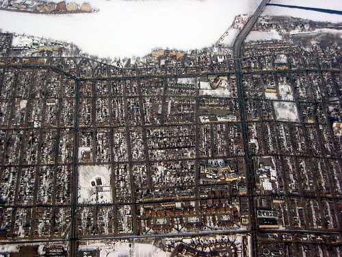
nice aerial pic of montreal’s north shore:

montreal's north shore

[via spacingmontreal]

Everyscape

Civicaccess.ca is about liberating public data from public institutions and finding new ways to make these accessible and useful. So far we have been doing a good job talking about data access, some members on the list are doing some interesting work with postal code files and electoral boundaries, and some of us are writing on this blog to share new technologies, ideas, projects and issues. For the most part and so far cool technology and science examples are from the US and not many derive from home – Canada. Sigh! And alas this one is no different.

Everyscape is really interesting to me as it merges panoramic photographs and a building’s blueprint, a type of data and communication form I learned to draw and read in college, but is generally illegible/inaccessible to most not involved in building things. When I look at a blue print I see the 3 dimensions of a structure and its composition but it is hard to get a sense of space and the place. That’s why architects start with maquetes and sketches. Blue prints happen after that process to communicate to engineers, builders, and workmen (some workwomen) who will actualize the space. This software builds a 3d space from the plane views of the blue print – building’s map – and panoramic photos.

Within each photograph, a user can swivel through a full sphere of motion. To move users from within one panoramic photograph to the next, Everyscape’s servers estimate the locations of the cameras in each photograph and use that information to build sparse 3-D geometry that forms the building blocks for an animated 3-D transition.

The technology is not about getting somewhere it is about being somewhere. When I viewed the MIT hallway 3 MoK video, I was reminded of my architectural walking tours of old Chicago buildings, how my eye navigated the contours, paused at detail, moved through boring stuff quickly to get to a more interesting space.Everscape in MIT Technology Review

This may be a disruptive technology to the 3D viz scientists and 3d modeller geomaticians as google earth was to cartographers and GISers. Mostly though, I like the fact that it seems to make space and place data more accessible, usable, understandable and immersive. Hopefully there will be some interesting public applications!

It is not what you think! It’s a visualization poling tool that shows what people think about a particular politician’s quote during an election, in this case the elections in Australia. Online opinion polls are always tricky, as they are driven by how the question is framed, the media outlet that poses it, they often miss the opinions of the non connected which are often those in rural and remote areas or of lower income or particularly less connected demographic groups. Nonetheless it is an interesting way to get a sense of what a select sub section of a population – connected, urban, msn news reader, literate with new media savvyness – thinks.

Passion PulsePassion Pulse Map

Via my Favorite: Information Aesthetics

The World Freedom Atlas is:

an online geo-visualization tool that shows a number of freedom indicators so to speak. For example, you can map by a number of indexes such as raw political rights score, civil liberties, political imprisonment, freedom of religion, freedom of speech, or torture. If I’ve counted correctly the data comes from 42 datasets divided into three categories:

[from the wonderfully-named blog, flowingdata.com]

« Older entries § Newer entries »